Tiffany Blue
“Tiffany Blue is the colloquial name for the light medium robin egg blue color associated with Tiffany & Co., the New York City jewelry company. The color was used on the cover of Tiffany’s Blue Book, first published in 1845.[1] Since then Tiffany & Co. has used the color extensively on promotional materials, including boxes and bags.
The Tiffany Blue color is protected as a color trademark by Tiffany & Co. in some jurisdictions including the U.S.[2][3]
The color is produced as a private custom color by Pantone, with PMS number 1837, the number deriving from the year of Tiffany’s foundation. As a trademarked color, it is not publicly available and is not printed in the Pantone Matching System swatch books.” (source: Wikipedia)
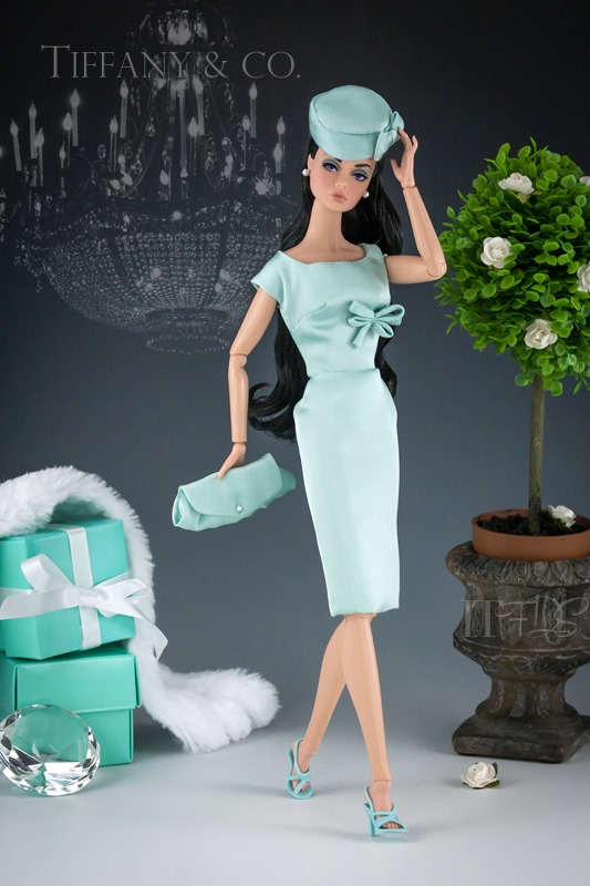
Just say the name “Tiffany Blue” and instantly people know exactly what color you are talking about. When I think of this color, I have an almost visceral response. It has come to mean not just “Oh I’m getting something really special if it’s in a box like that” but indicative of the upper echelon of beauty, style and elegance. If something is presented in that color, I’m going to spend time looking at it. It’s the reason why I stand transfixed when a Korean Air commercial comes on….it uses that color. Only one other color approaches this kind of power in my life…Barbie pink of course. So, it can come as no surprise that when Matisse had a dress of this color for sale, I went after it like a shark after a chum boat.
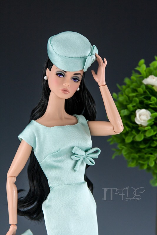
Miss “The Happening” Poppy Parker is wearing a Mattise outfit with matching hat and clutch. Shoes are by Mattel. The faux fur wrap is also by Mattise and Poppy’s pearl earrings were borrowed from a sister Poppy whose name escapes me at this time.
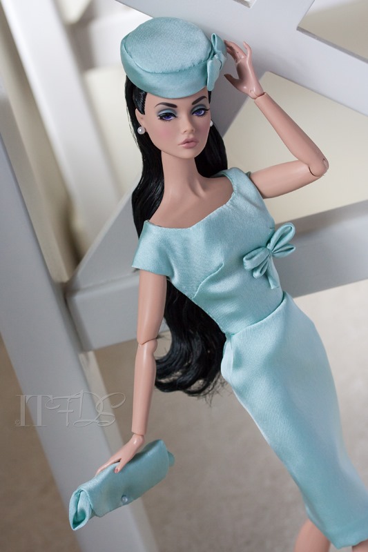
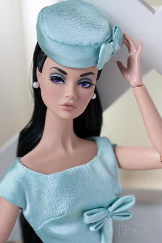
I was all set to type this blog post up and call it a day…and then the sun came out in the doll room…and I had to take some more shots. I also think its important to note the difference between studio lighting and actual daylight. while I strive to be as color accurate as I can when I photograph things in the tabletop studio, invariably there will be color variation. Both settings also have a different and distinct feeling. Most of what I do, is in the studio. I like the look and feel of it. I am branching out to more natural light shoots but I only anticipate being able to do that in the summer months. I have noticed that outdoor shots of dolls is enjoying a renaissance on the doll boards. It is really beautiful and inspiring to see.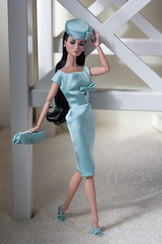
Brenda…I think I like the dress. ![]() I adore your work!!
I adore your work!!

